Executive report timeline template
Executive report timeline template to craft clear, compelling summaries, pitch proposals with confidence, engage decision-makers, and drive action.


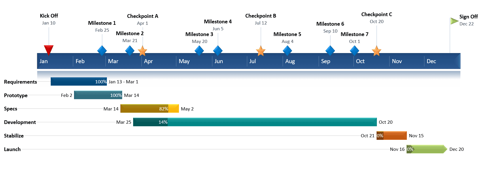
A timeline is a type of chart which visually shows a series of events in chronological order over a linear timescale. The power of a timeline is that it’s a visual representation, which makes it easy to understand critical milestones in a project and the progress of a project schedule. Timelines are particularly powerful for project scheduling or project management when paired with a Gantt chart, as shown at the end of this tutorial.
Microsoft Excel has a Scatter chart that can be formatted to create a timeline. If you need to create and update a timeline for recurring communications with clients and executives, it would be simpler and faster to create a PowerPoint timeline.
On this page you can see both ways to create a timeline using these popular Microsoft Office tools. We will give you step-by-step instructions for making a timeline chart in Excel by formatting a Scatter chart. We will also show you how to instantly create an executive timeline in PowerPoint by pasting your project data from Excel. And if you'd rather skip the manual work, you'll find a curated set of Excel timeline templates, including a project management timeline template, further down the page.
a) List out the key events, important decision points or critical deliverables of your project. These will be called Milestones and they will be used to create a timeline.
b) Create a table out of these Milestones and next to each milestone add the due date of that particular milestone.
c) To create a timeline in Excel, you will also need to add another column to your table that includes some plotting numbers. Add the new column next to your milestone description column and list out a repetitive sequence of numbers such as 1, 2, 3, 4 or 5, 10, 15, 20 etc. Excel will use these plotting points to vary the height of each milestone when plotting them on your timeline template.
For this demonstration we’ll format the table in the image below into a Scatter chart and then into an Excel timeline. Then we’ll use it again to make a timeline in PowerPoint.
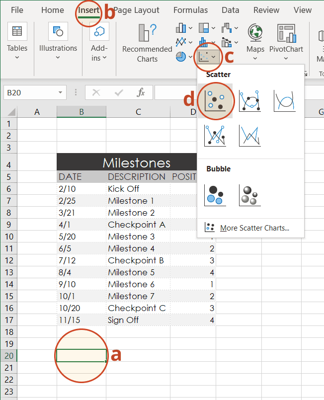
a) From the timeline worksheet in Excel, click on any blank cell.
b) Then from the Excel ribbon, select the Insert tab and navigate to the Charts section of the ribbon.
c) In the Charts section of the ribbon drop down the Scatter or Bubble Chart menu.
d) Select Scatter which will insert a blank white chart space onto your Excel worksheet.
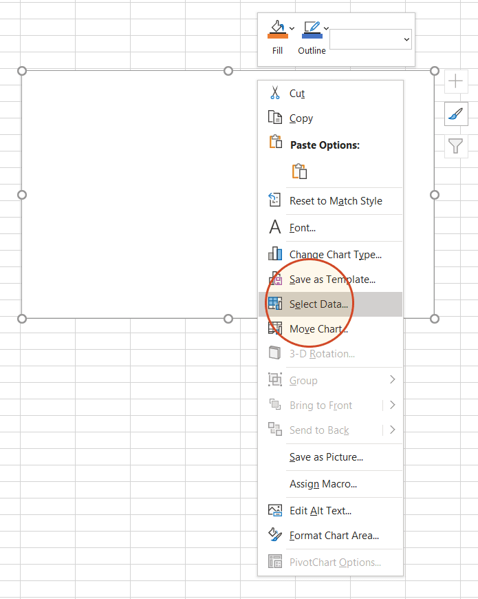
a) Right-click the blank white chart and click Select Data to bring up Excel's Select Data Source window.
b) On the left side of Excel's Data Source window, you will see a table named Legend Entries (Series). Click on the Add button to bring up the Edit Series window. Here you add the dates that will make your timeline.
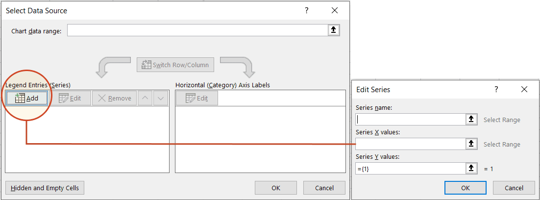
c) We will enter the dates into the field named Series X values . Click in the Series X values window on the arrow button.

Then select your range by clicking the first date of your timeline (ours is 2/10) and dragging down to the last date (ours is 11/15).
Following the same path, we will enter the plotting numbers series into the field named Series Y values. Click in the Series Y value window and remove the value

that Excel places in the field by default. Then select your range by clicking on the first plotting number of your timeline (ours is 1) and then dragging down to the last plotting number of your timeline (ours is 4).
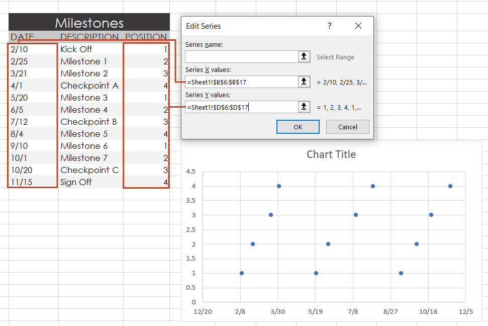
d) Click OK and then click OK again to create a scatter chart.
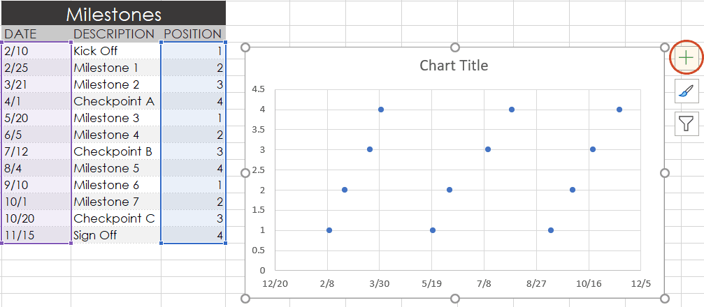
a) Click on your chart to bring up a set of controls which will be presented to the upper right of your timeline's chart. Click on the Plus button (+) to open the Chart Elements menu.
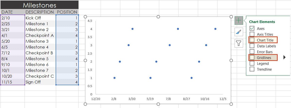
b) In the timeline's Chart Elements control box, uncheck Gridlines and Chart Title.
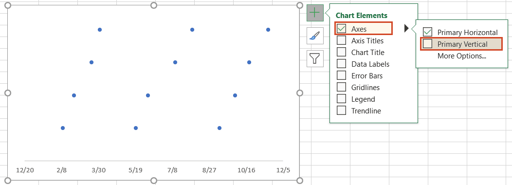
c) Staying in the Charts Elements control box, hover your mouse over the word Axes (but don't uncheck it) to get an expansion arrow just to the right. Click on the expansion arrow to get additional axis options for your chart. Here you should uncheck Primary Vertical but leave Primary Horizontal checked.
d) Staying in the Charts Elements control box just a little longer, add Data Labels and Error Bars.
Your timeline chart should now look something like this:
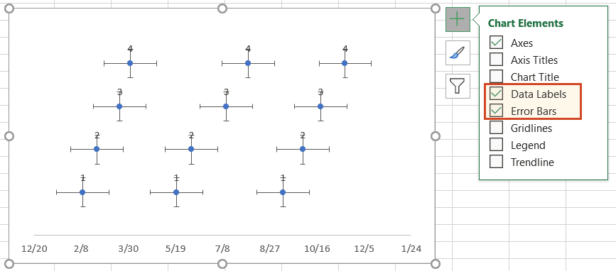
a) To make a timeline in Excel, we will need to format the Scatter chart by adding connectors from your milestone points. Right-click on any one of the dates at the bottom of your timeline and select Format Axis to bring up Excel's Format Axis menu.
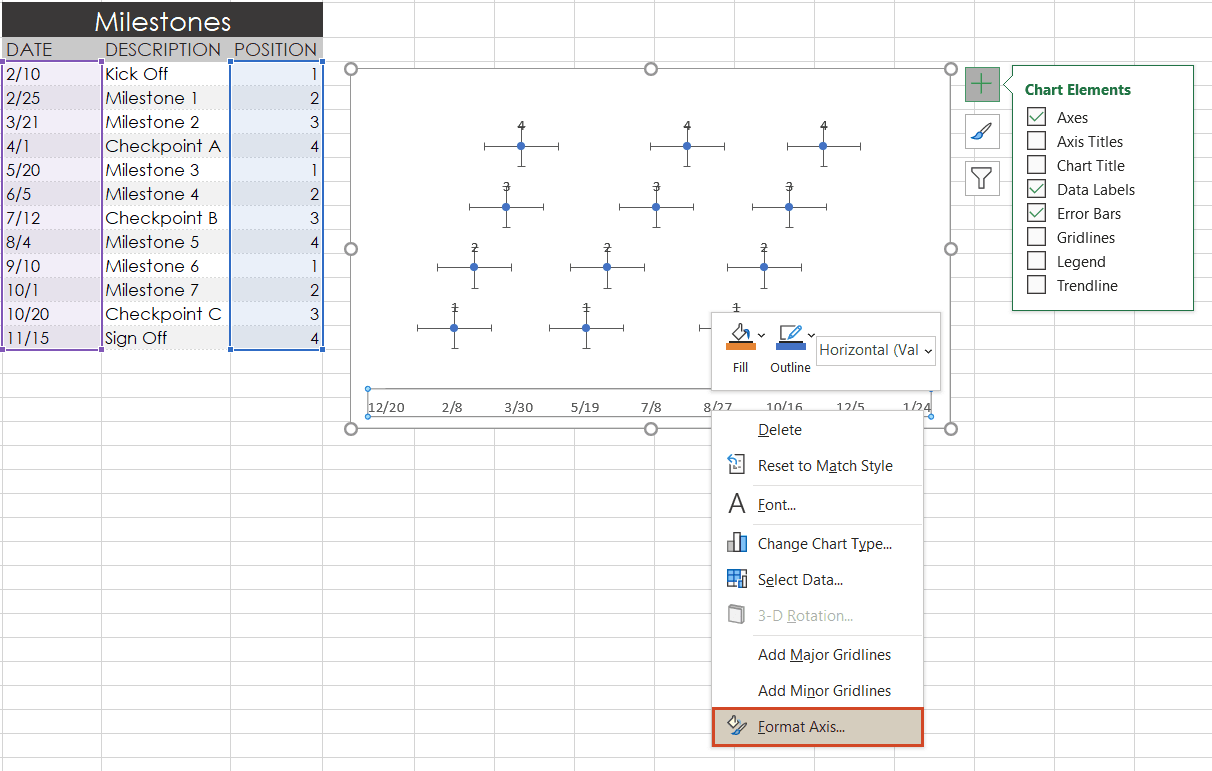
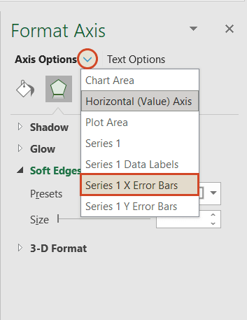
b) Drop down the arrow next to the title Axis Options and select Series 1 X Error Bars.
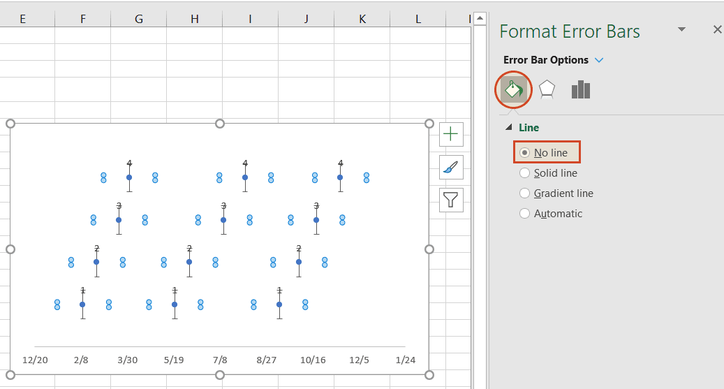
c) Under the Error Bar Options menu, click on the paint can icon to reveal the Fill & Line controls. Select No line, which will remove the horizontal lines around each of the plotted milestones on your timeline.
d) In a similar process, we will also adjust your timeline's Y axis. Again, from the timeline, right-click on any one of your timeline's dates at the bottom of the chart and select Format Axis. Drop down the arrow next to the title Axis Options and select Series 1 Y Error Bars.
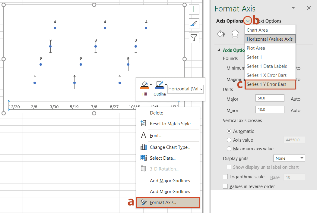
e) Right-clicking on any bar in the chart will open the Format Error Bars menu. From the Vertical Error Bar, set the direction to Minus. Then set the Error Amount to Percentage, and type in 100%. This will create connectors from your timeline's milestones to their respective points on your timeband.
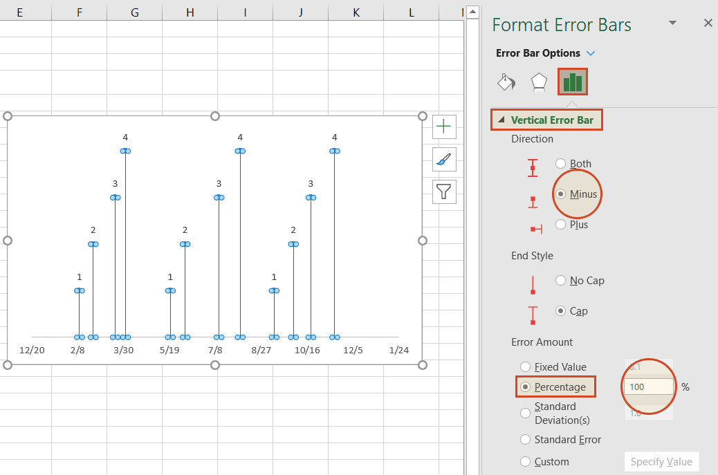
Your Excel timeline should now look something like the picture below.
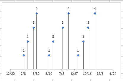
You have built a Scatter chart as an Excel timeline. Now we will format it into a proper timeline.
a) To finish making your timeline, we will add the milestone descriptions. Staying in the Format Axis menu, again drop down the menu arrow next to the title Axis Options. This time choose select Series 1 Data Labels to bring up the Format Data Labels menu.
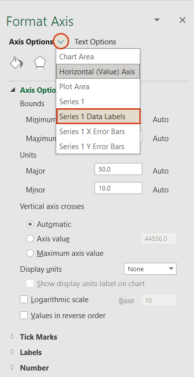
b) Click the Label Options icon. Uncheck Y Value, and then put a check next to Value From Cells. This will bring up an Excel data entry window called Data Label Range.
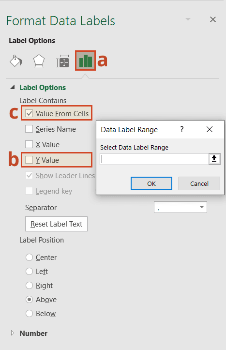
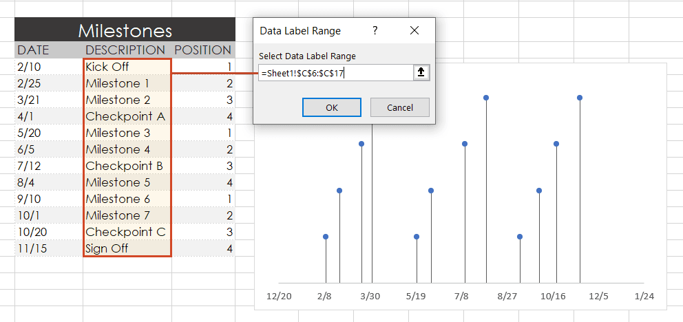
c) In the Select Data Label Range window, you will enter your timeline's milestone descriptions from the timeline table you built in step 1. To do this simply click on the description for the first milestone in your timeline table, (ours is Kick Off), then drag down to the last milestone in your timeline (ours is Sign Off). Click OK.
Your Excel timeline template should finally look more like this now:
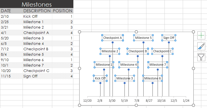
Now you can apply some styling choices to improve the aspect of your timeline.
a) Coloring your timeline's milestone markers.
From your timeline, right-click on any of the milestone points (caps) and select Format Data Series to bring up the Series Options menu.
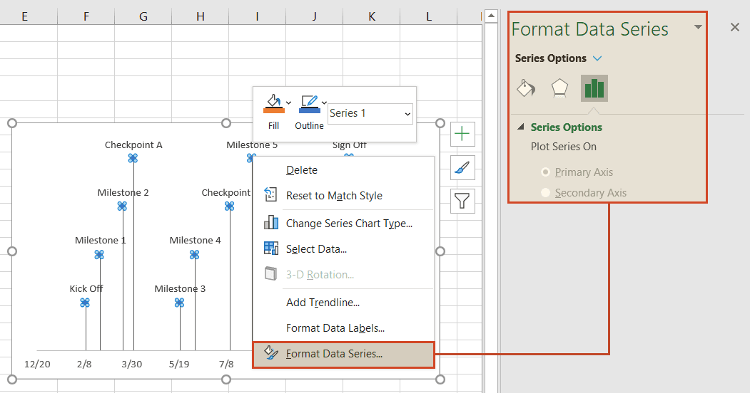
Select the paint can icon for Fill & Line options and, then choose the tab for Marker. You may also need to select Fill to reveal its menu. Then you can choose coloring options for your timeline's milestone markers. In our example, we selected Vary colors by point, which lets Excel pick the milestone colors for our timeline.

b) Change the vertical connector's transparency.
On your timeline, right-click on any of the vertical connectors that connect your milestones with the timeband below. Select Format Error Bars to bring up the Vertical Error Bar menu. Again, select the paint can icon to choose Excel's Line & Fill options. Here you can make formatting adjustments (color, size, style, etc.) to your timeline's connector lines. In our example we set the transparency of the lines to 50%.
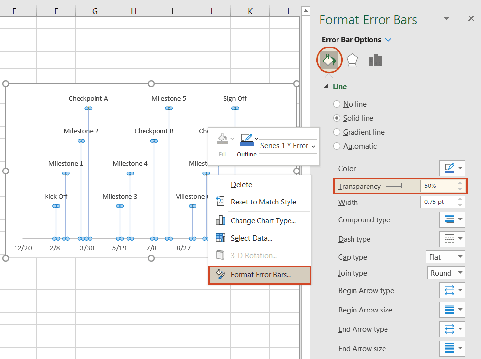
c) Vary the height of each milestone so their descriptions are not overlapping the neighboring milestone.
Remember the repeated sequence of numbers you added to your timeline table in step 1. Well, those set the height of each milestone on your timeline. By adjusting these numbers, you can play around with different height positions for each milestone. For example, to optimize our timeline, we used the number sequence, 1, 2, 3, 4, 1, 2, 3, 4.
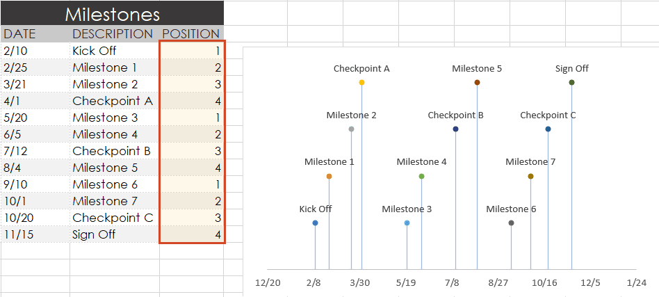
Look how the descriptions would overlap if we changed the order (Don’t try this at home! 😊):
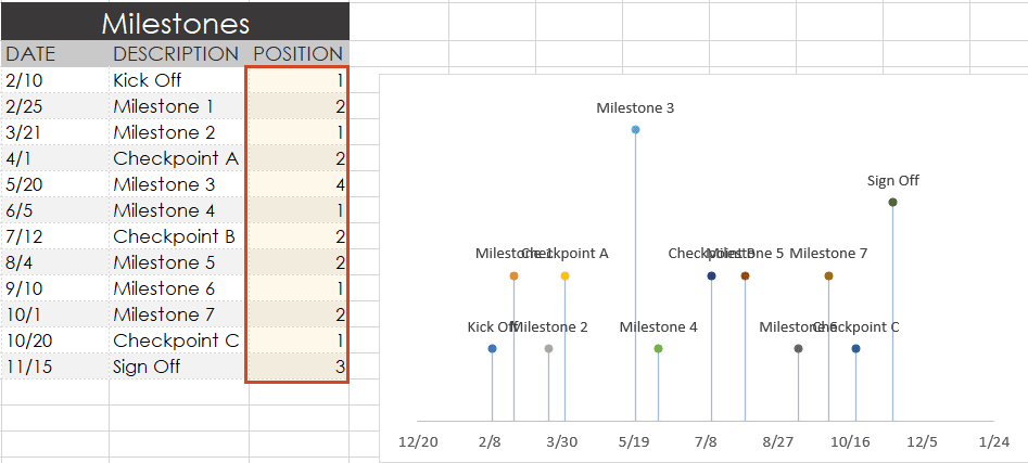
d) Trim off the empty space to the left or right of your Excel timeline by adjusting its minimum and maximum bounds.
Again right-click on any of the dates below your timeband. Select Format Axis.
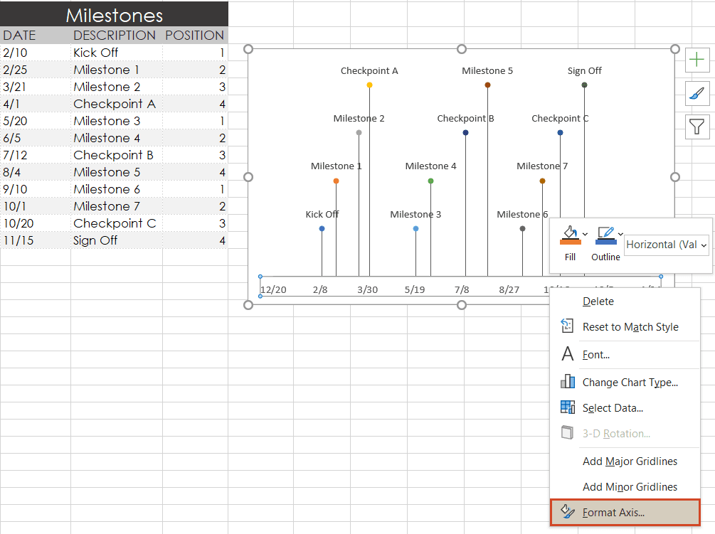
Under the heading Bounds, adjusting the Minimum number upward will move your first milestone left on your timeline, closer to the vertical Axis. Likewise, adjusting the Maximum number down will move your last milestone right on your timeline, closer to the right edge of your chart.
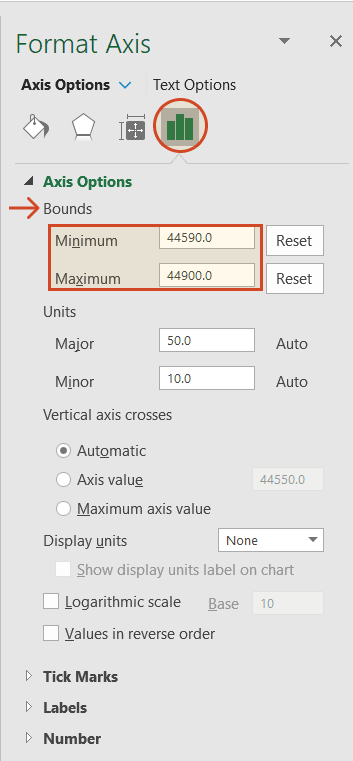
Finished! Our timeline now looks like this:
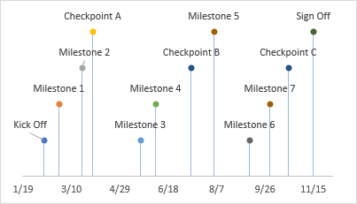
To help you get started quickly, we have included a free project timeline Excel template that you can download and customize. It's a good way to learn how to create a project timeline in Excel without building everything from scratch.

Building timelines manually in Excel works, but it's still time-consuming if you need professional, presentation-ready visuals on a recurring basis. For teams that rely on a project management timeline template to communicate schedules, an automated approach saves hours of formatting.
If you prefer to stick to spreadsheets, we’re developing Lucen Plan, an Excel-based add-in (currently in Beta) that helps you create project timelines natively – no switching tools required.
For now, our suggestion for a faster, more polished result is to use a timeline tool like the Lucen Timeline add-in for PowerPoint. With it, you can paste the Excel table you created above straight into PowerPoint and instantly generate a timeline that you can present to clients or executives. To begin, you will need to install Lucen Timeline, which will add a timeline creator tab to PowerPoint.
a) Inside PowerPoint, click on the Lucen Timeline tab, and then click the New icon.

This will open a gallery where you can choose between various timeline styles, stock templates and even custom templates.
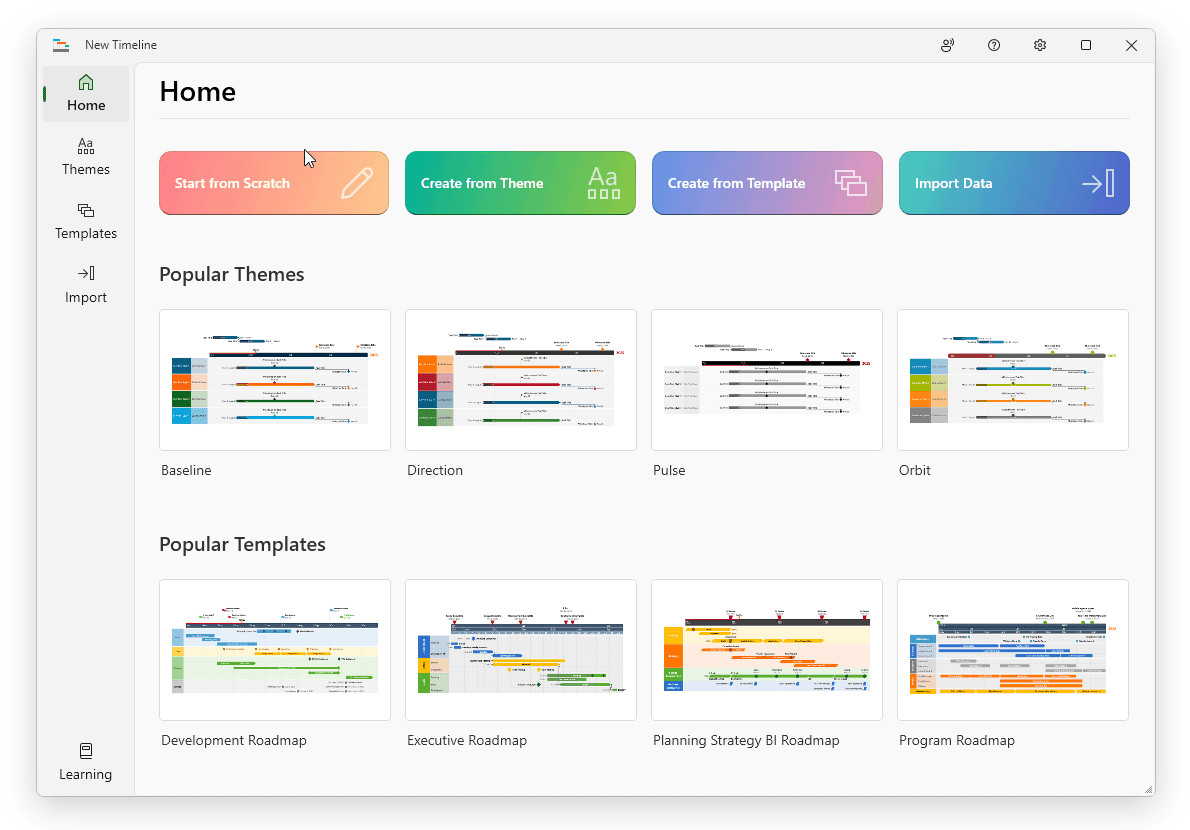
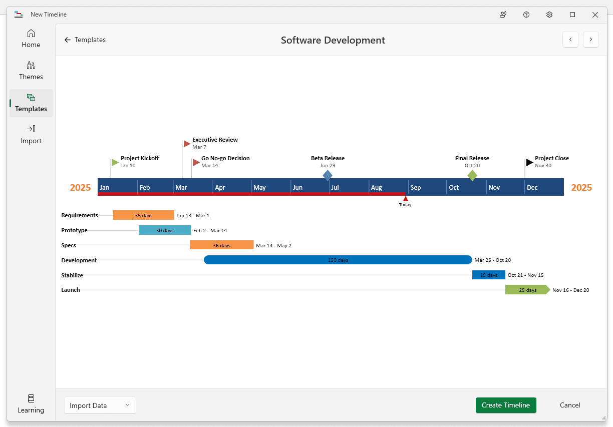
b) From the gallery, double-click the style or template you wish to use for your timeline to open its preview window and then select Create timeline. (You can find more designs in our timeline templates library.) For this demonstration, we will choose the Software Development timeline template. If you prefer to import and refresh your Excel table, rather than copy-paste, click on the Import button in the preview window.
c) Copy the data from Excel
We have updated our data a bit, so that we get the timeline, but also a more detailed view of our project: we deleted the Timeline column, as we don’t need it, and added a list of tasks (with start and end dates and duration).
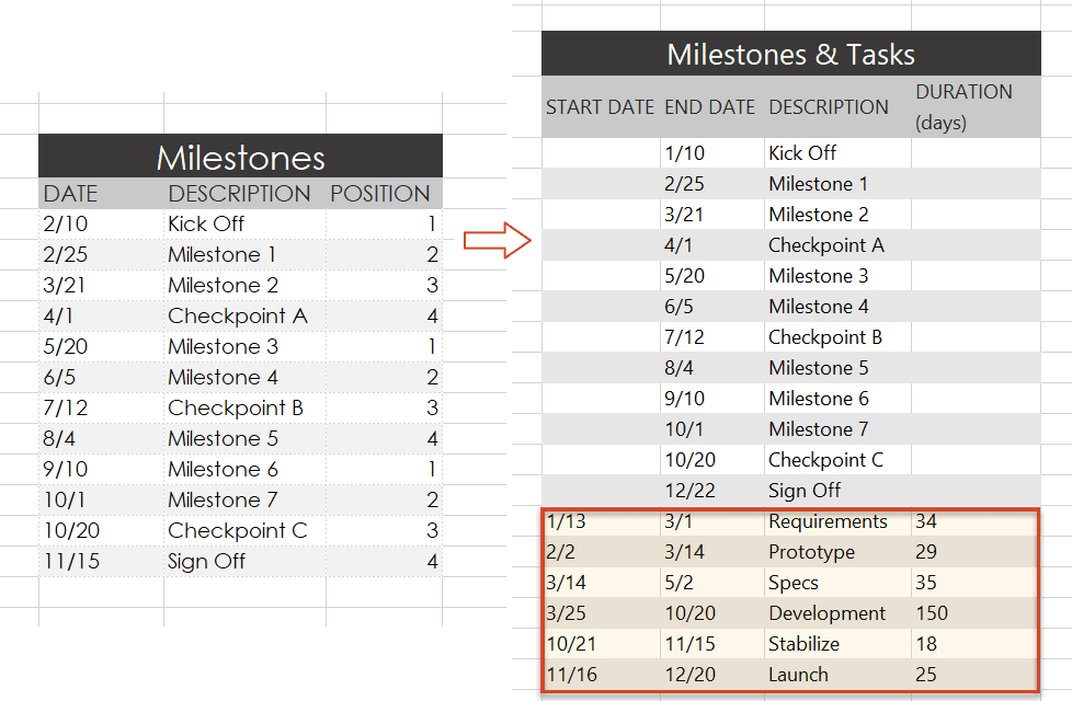
Copy the data from your Excel table, but make sure not to include the column headers.
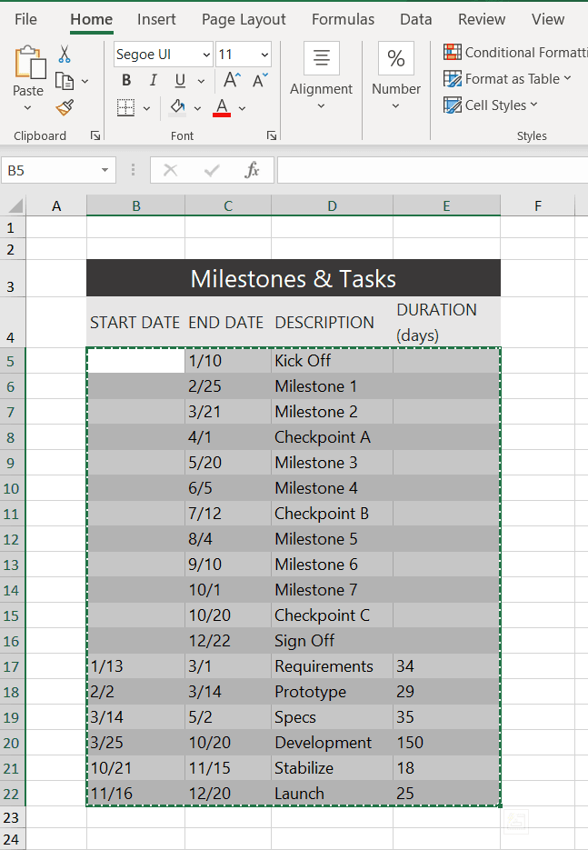
d) Now, simply paste the section into PowerPoint by using the Paste button in the upper-right corner of the Edit Data wizard.
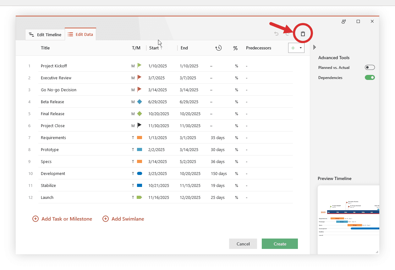
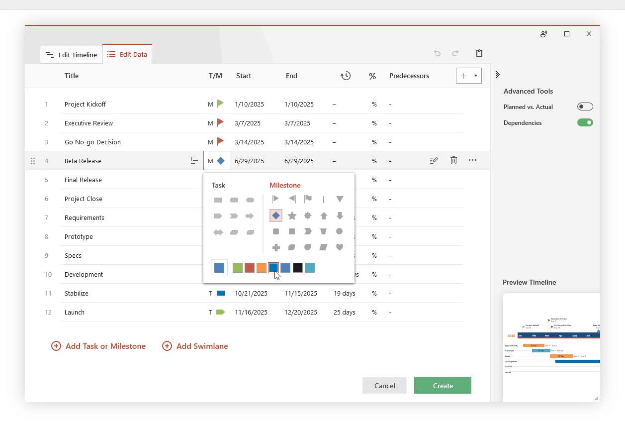
Make edits if necessary (such as changing milestone shapes and colors or adding and removing items) and click the Create button.
a) Depending on the template or style you selected from the gallery, you will have a timeline similar to this:
b) You can easily customize the timeline further using Lucen Timeline. In our example above, we added percent complete, removed the Today’s Date marker, changed milestones, adjusted colors, and added tasks to create a Gantt chart.
If you’d like to use the timeline created in this guide as a template to help you move faster, you can download the file below, free of charge.

You can also use Lucen Timeline’s online timeline maker to easily build timelines and other similar visuals that you can instantly update and share with executives and teams.
Here are three ways to make a timeline in Microsoft Excel:
1. Insert a chart and turn it into a timeline. Find out how to do this in our step-by-step tutorial on how to make a timeline in Excel.
2. Build a timeline with SmartArt. These are the quick steps to make a timeline with SmartArt:
a) In your Excel file, go to Insert > Illustrations > SmartArt.
b) In the Choose a SmartArt Graphic dialog box, select Process, pick a layout, then click OK.
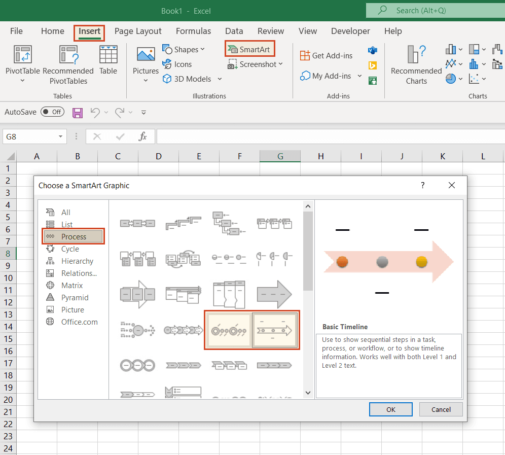
c) On your SmartArt graphic, click [Text] to edit and add data.
d) Add items to your timeline by right-clicking on a shape, then Add Shape > Add Shape After/Before.
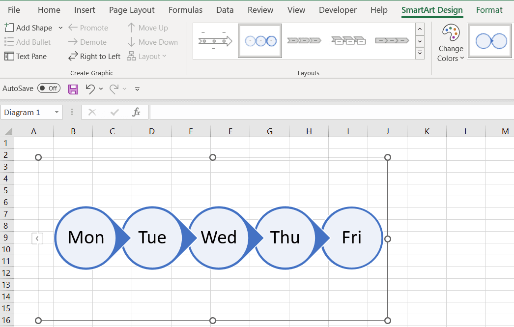
e) Customize your timeline. After you create the timeline, you can style it further, add or move dates, change styles, layouts, or colors by using the options in the SmartArt Design and Format tabs that show on the menu ribbon when you select the SmartArt graphic.
Note: Be aware that the SmartArt Design and SmartArt Format tabs are contextual tabs. This means that they are not visible all the time. They only show when you select a particular object which can be edited using special options.

Tip: This solution also works with Microsoft Word, PowerPoint, and Outlook. For more detailed instructions, check out any tutorial in our series on how to make a timeline in Excel.
3. Use a free, fast, automated timeline making tool.
Since the manual methods require considerable time and customization efforts, we suggest an easier, automated way, good for complex timelines that you can use with your Excel data. This method requires downloading a free, specialized timeline maker: the Lucen Timeline PowerPoint add-in.
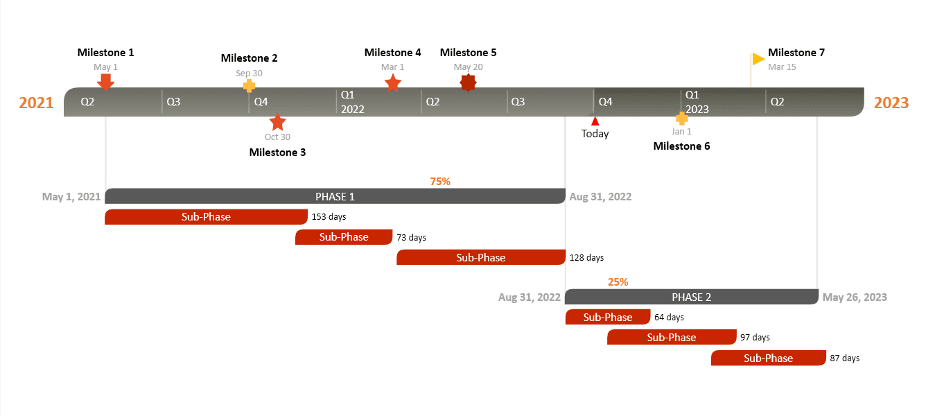
This is a time-saving solution, offering a variety of pre-built templates to choose from. You just pick your template, copy-paste or import your Excel data and quickly generate beautiful timelines. The timelines are presentation-ready PowerPoint slides that can be saved as images, so you can easily include them in Microsoft Excel or other Microsoft Office files. Depending on the template that you choose, your timeline could look like this:
Yes, there are several ways to make a timeline in Excel:
With SmartArt:
Note: This method is rather manual and tedious. A lot of time will be needed for customization.
Complexity: MEDIUM | Time: HOURS | Results: NOT GREAT
With Charts:
Note: The chart will need extra workaround formatting to make it look like a timeline, which could prove very time-consuming.
Complexity: HARD | Time: HOURS | Results: MEDIUM
With Lucen Timeline:
Note: Lucen Timeline is a PowerPoint add-in that helps you create professional timelines. You can try out the add-in’s premium edition for free for 14 days.
Complexity: EASY | Time: MINUTES | Results: GREAT
Here’s how you can build a simple timeline in Excel:
Depending on the timeline layout you chose, the result can look like this:
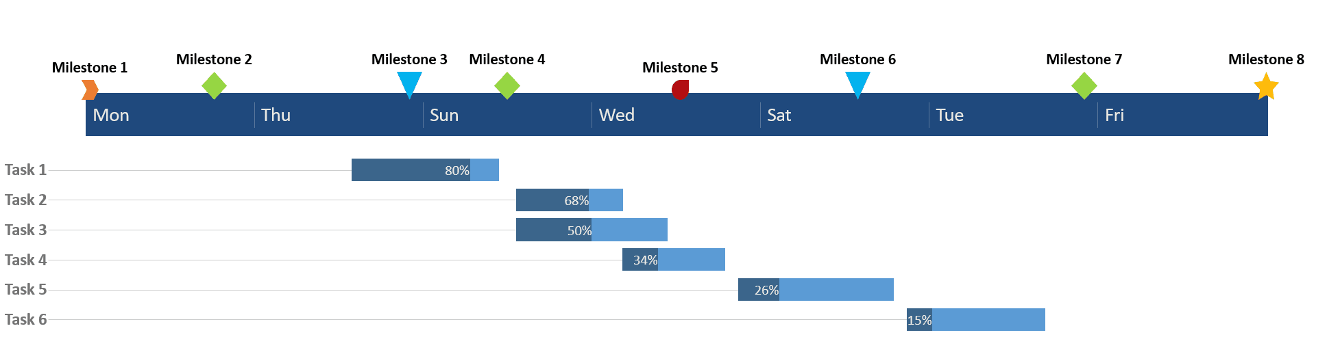
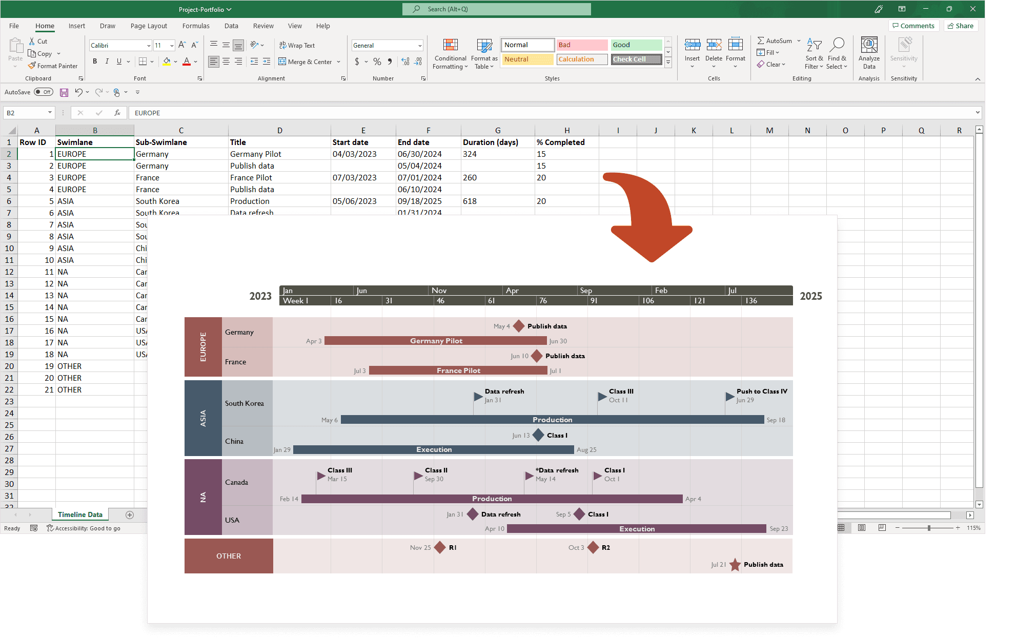
We suggest an easier, more professional way to build simple, yet better-looking timelines using your Excel data: quickly generate the timeline in PowerPoint using our handy add-in called Lucen Timeline. With this automated tool, you can copy-paste your data from Excel to PowerPoint through its intuitive data entry wizard. Once you’ve entered your project information, Lucen Timeline will automatically process and turn it into a stylish timeline that you can then include in Excel spreadsheets and Word documents or use as a stand-alone PowerPoint slide. Here is how your timeline could look like:
You can make a timeline chart in Excel by manually formatting a basic Scatter chart. You should know that the amount of customization and editing work needed to transform the initial chart into an actual timeline-looking visual might prove tedious and challenging. However, simple timeline charts can be created in Excel by following these basic steps:
A faster, easier way is to make your timeline chart in PowerPoint and then insert it into your Excel file as an image or object. For stylish visuals with minimum effort, our suggestion is to use a professional tool such as Lucen Timeline. Its free version includes templates like these, that you can use to generate timelines from your Excel data:
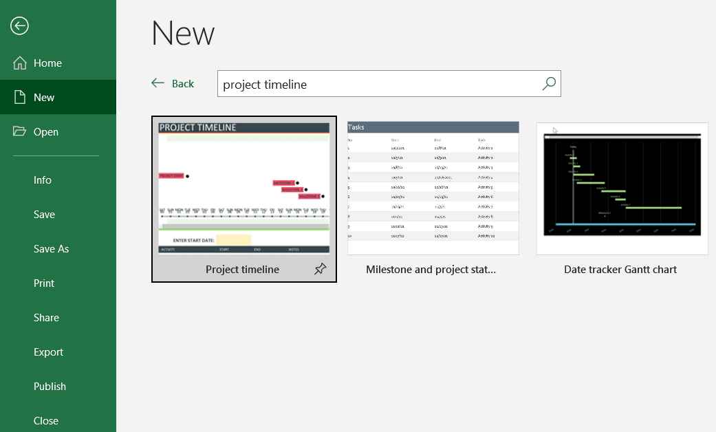
The simplest way to create a project milestone timeline in Excel is to use the spreadsheet platform’s native “Project timeline” template. It includes milestones as well as a customizable data table needed for your timeline. You can find the project timeline template in Excel by going to File > New and searching for “project timeline”:
An equally simple, yet more effective way is to use your Excel data to automatically generate a project milestone timeline directly in PowerPoint, with the help of our PowerPoint add-in, Lucen Timeline. You can use the resulting visual in any Excel spreadsheet, Word document, or PowerPoint presentation. Your timeline may look like this:
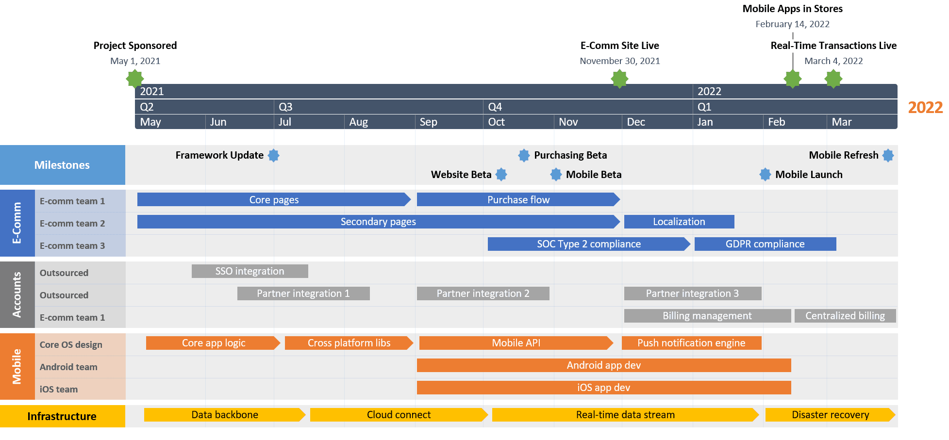
For this, you’ll first need to download the free Lucen Timeline add-in. Then, once ready, you simply pick a preferred template, type in or copy-paste your data from Excel, and you are all set. As simple as that!
There are two ways to convert Excel data into a timeline: either using Excel’s native features or leveraging the power of an automated timeline maker. Below, we’ll briefly describe the steps for each method.
Yes, Microsoft Excel offers a few templates that you can customize to create various types of timelines. To explore them, go to File > New and check the template preview list. If you cannot find what you need, type “timeline” in the Search for online templates box to refine the search and further filter the available options.
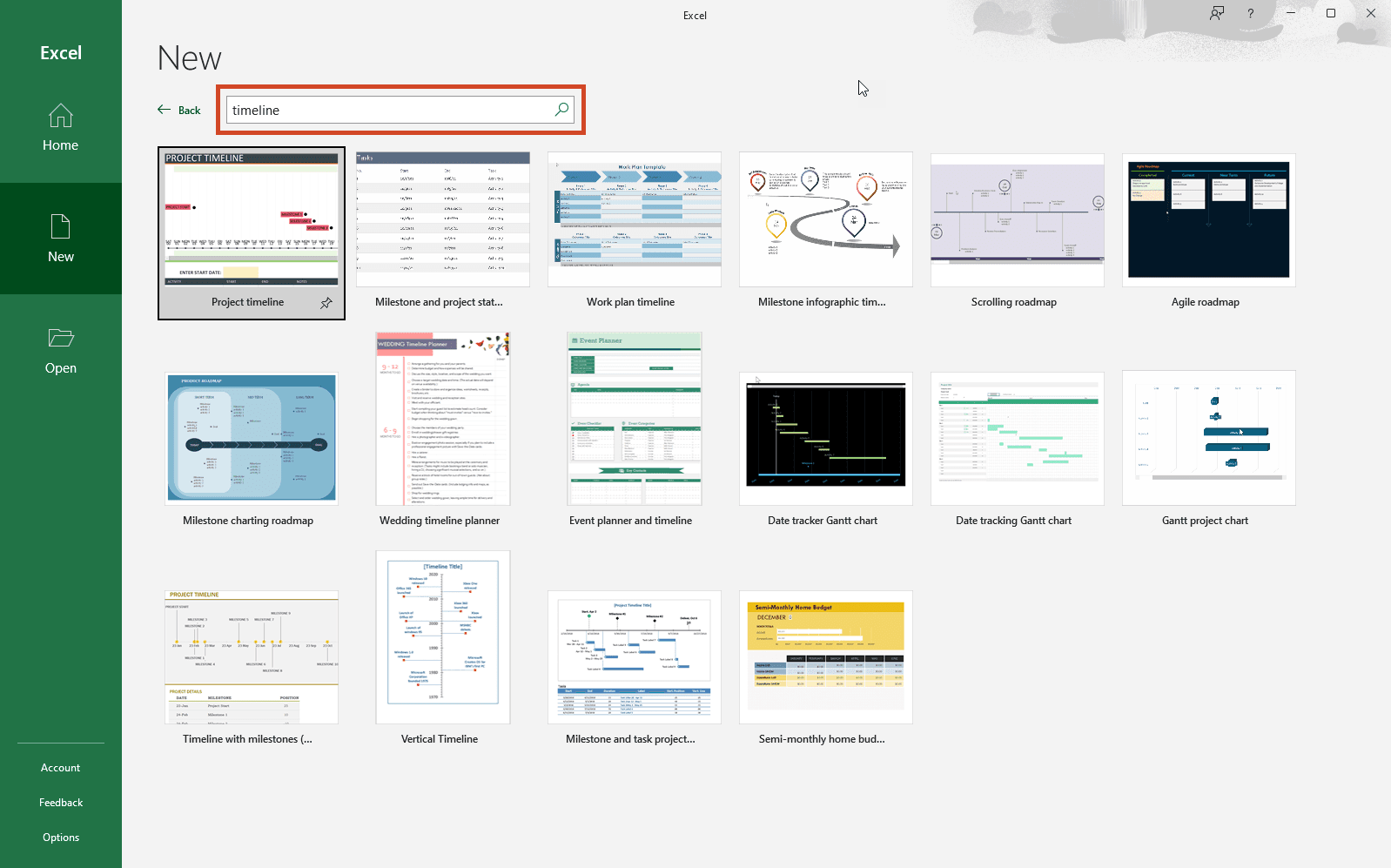
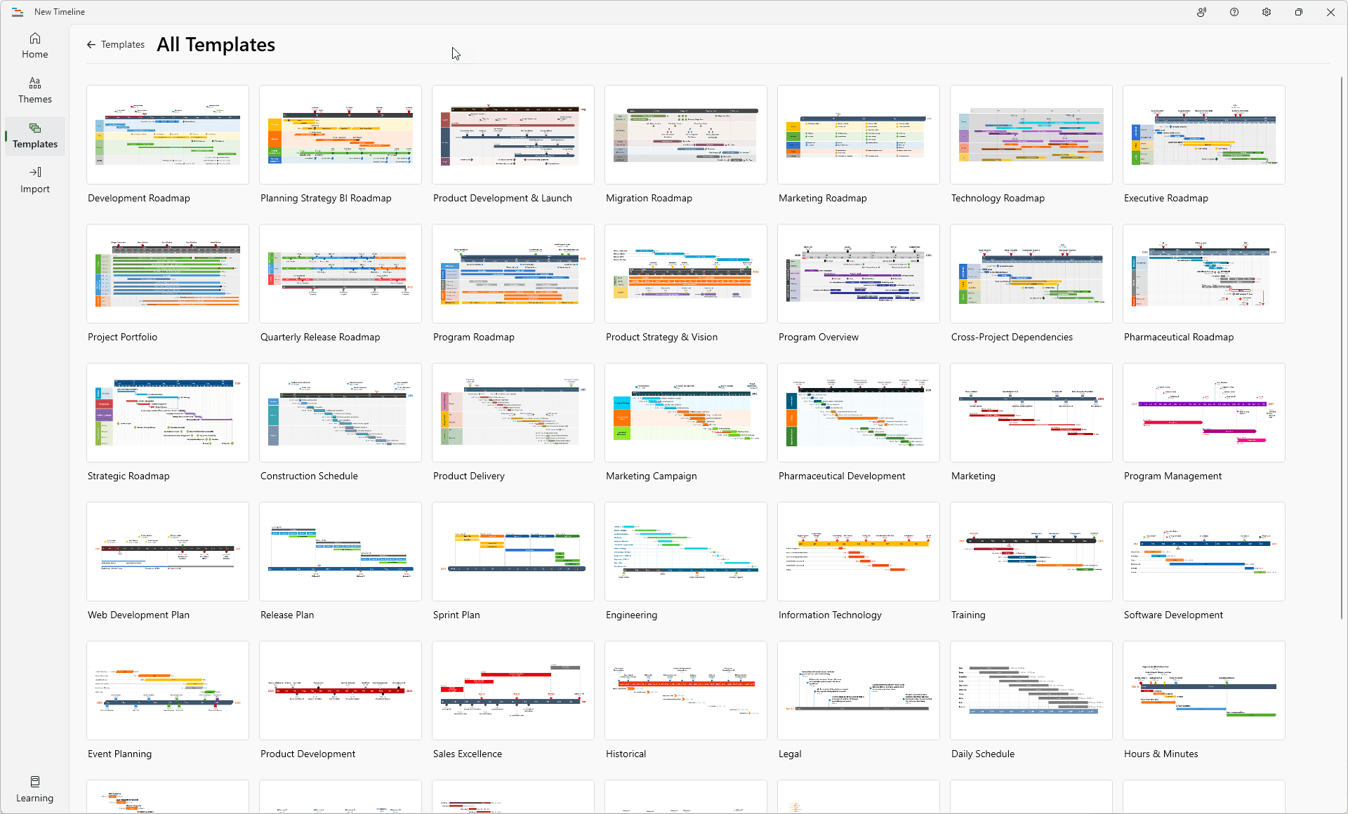
If you’re not happy with the limitations of the standard timeline templates in Excel, have a look at the library of professional timeline templates created with our PowerPoint add-in called Lucen Timeline, an automated timeline maker that you can use to make timelines with your Excel data and that offers a free version. Here is a preview of the templates you’ll find:
Here are the main 3 ways in which you can move a timeline from Excel to PowerPoint:
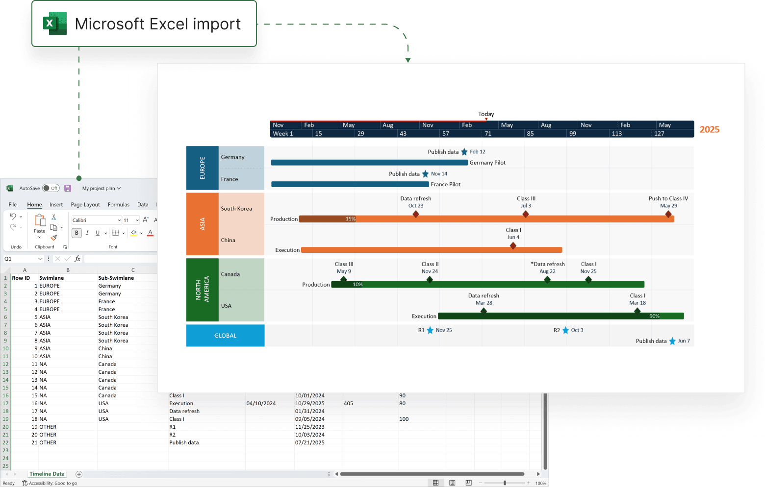

Executive report timeline template to craft clear, compelling summaries, pitch proposals with confidence, engage decision-makers, and drive action.

PowerPoint event planning timeline template showing key milestones such as venue booking, vendor coordination, promotion, and final event preparation on a single visual schedule.

Clear project timeline example designed to help project managers plan and communicate critical tasks, milestones, and overall progress at a glance.

Free, downloadable timeline graphic showing incident response planning in hours and minutes to minimize outages and restore operations quickly.

Renovation timeline designed to support construction planning with a high-level view of major phases, activities, and dependencies.

Simple, presentation-ready timeline that brings clarity and structure to complex private equity deals.
Use Lucen Timeline to easily transform your Excel data into clear, compelling visuals that enhance project communication.

Your download should start now. If it doesn’t start click here and check your inbox for tips to get started.