


Uncover where your plan is at risk with Planned vs. Actual
Instantly compare real progress to your original plan – right inside your PowerPoint timelines. Catch risks early, respond to change with agility, and build trust with executive-ready visuals that drive confident decisions.
Standardize reporting. Track progress. Improve forecasting.
Give your team and stakeholders one clear source of truth for project performance. With visual plan vs. actual comparisons, PMOs can drive consistency, build trust, and make better-informed decisions at every stage.
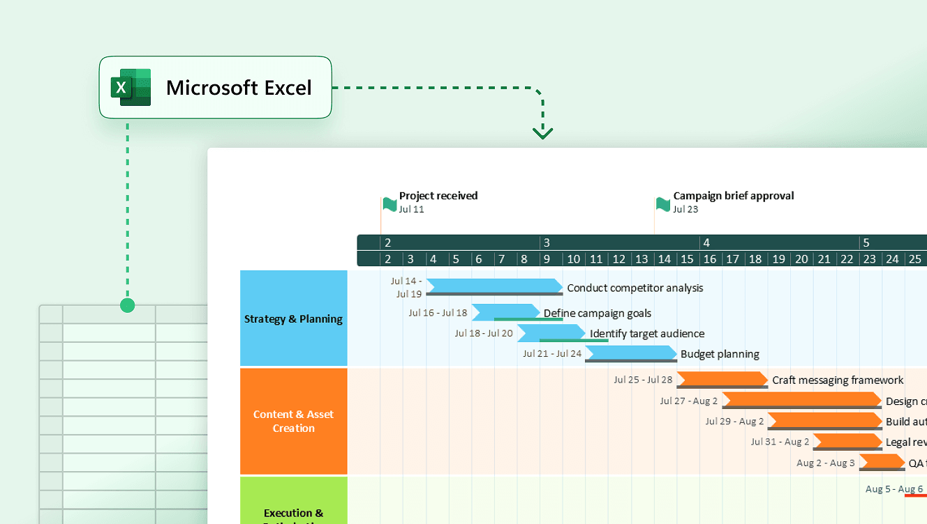
Import Excel data for instant baseline comparisons
Pull project data from Excel to instantly compare actual progress against your plan. One-click refresh keeps everything current, so you always know where your project really stands.
Track performance against your project plan
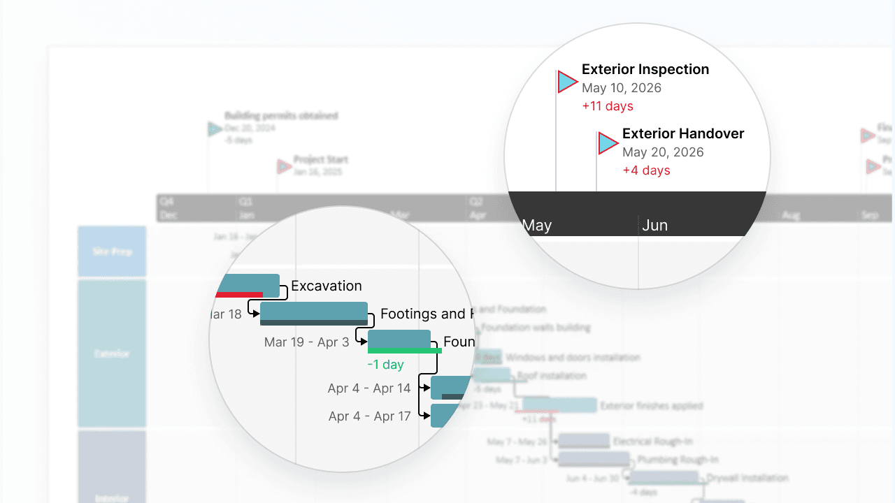
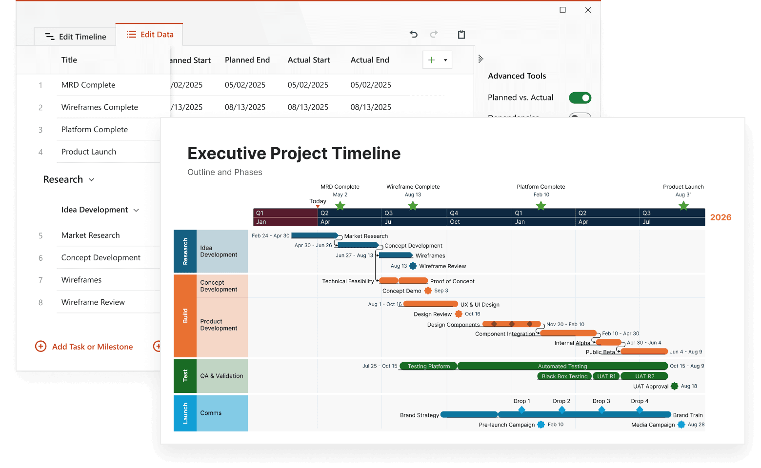
Visualize progress against your original plan with side-by-side comparisons showing task and milestone variances. Clear conditional formatting and streamlined controls highlight deviations so you can spot delays early, identify risks before they escalate, and keep teams aligned.
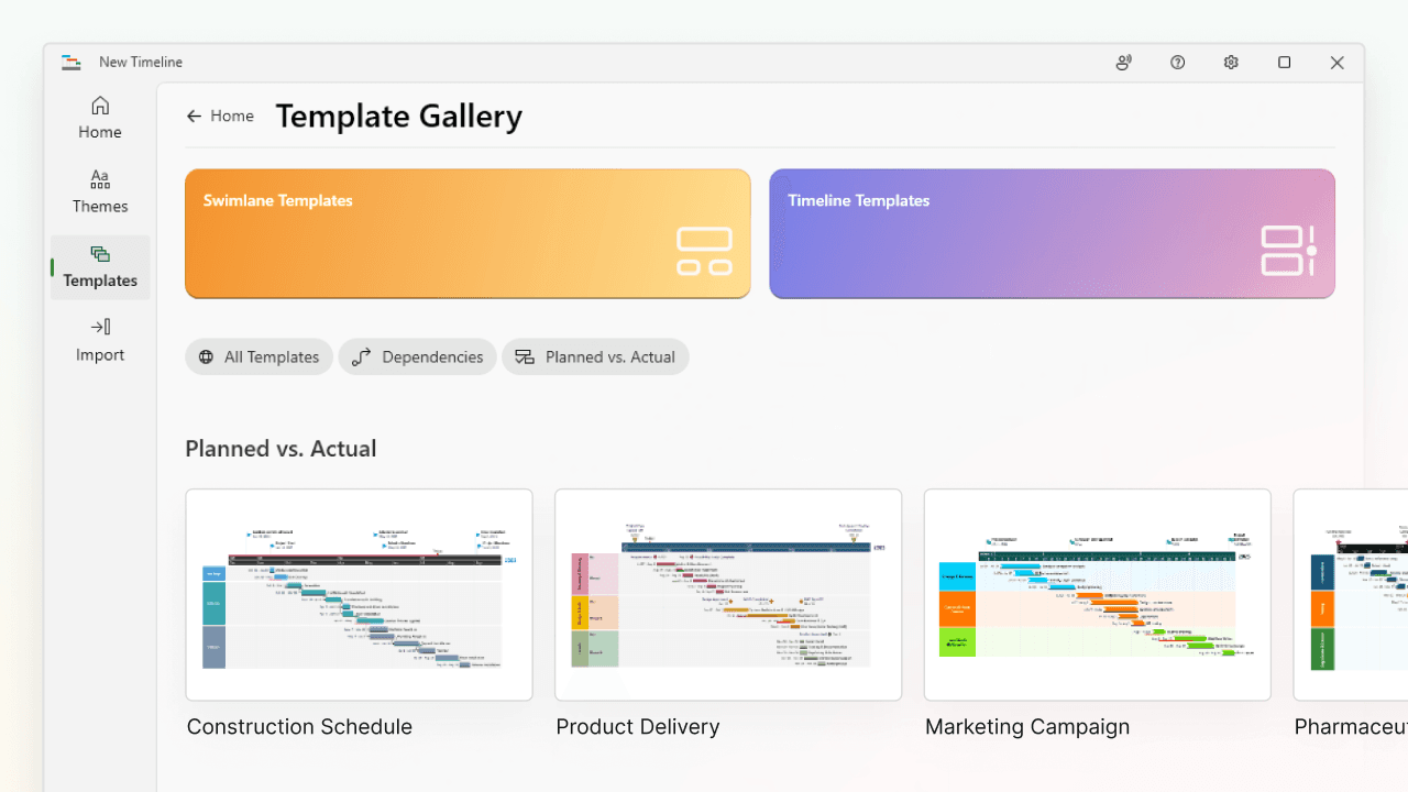
Standardize reporting with built-in timeline templates
Kick off tracking with purpose-built templates designed for Planned vs. Actual reporting. Set baseline styling and conditional formatting through themes to deliver consistent, presentation-ready visuals that save time, reduce manual work, and help PMOs build credibility with executives.

Improve forecasting with performance insights
Use real-world variance data to understand how your plans hold up over time. Identify patterns in slippage or scope changes to improve future estimates and drag baselines to quickly adjust dates as you build more realistic, achievable timelines across your projects or programs.
Smarter insights for sharper project execution
Use visual timeline comparisons to stay on track, respond faster, and keep execution moving smoothly.

Communicate changes with executive-ready clarity
Use intuitive visuals and day-level variance to clearly explain shifting schedules. Help stakeholders understand the impact at a glance and speed up approvals without lengthy back-and-forth.

Swiftly adapt project timelines as priorities evolve
Quickly update your visuals as scope or timelines shift. Drag baselines to adjust dates effortlessly - everything updates automatically so your timeline always reflects the latest plan without tedious manual rework.

Automate updates across reporting workflows
Free up time with polished, presentation-ready timelines that update automatically. No need to duplicate slides or reformat – just plug in your data and stay focused on execution.

Refine future plans with historical variance data
Compare planned vs. actual to identify where projects typically diverge. Use these insights to build more realistic timelines for future projects.
Turn timelines into actionable project insights
Use Planned vs. Actual to track progress, adapt with confidence, and deliver updates that drive alignment and action – without the manual overhead.
Common questions about Planned vs. Actual
Planned vs. Actual is a timeline visualization tool that lets you compare planned dates to actual progress using side-by-side bars for each task. It makes deviations and trends immediately visible.
Planned vs. Actual is available exclusively with Expert plans.
Yes. You can compare planned and actual milestone dates to highlight schedule shifts. Task bar support is included as well.
You can adjust the color and transparency of the baseline bar, as well as toggle its visibility for individual tasks. Additional styling options will be added over time.
Planned vs. Actual works with custom templates and is fully compatible with Lucen Timeline’s dependency management features.
You can drag baselines directly in Edit Timeline view to quickly reflect changes without rebuilding your visuals from scratch.
Conditional formatting highlights early or delayed tasks and milestones based on their actual date compared to the original plan - making schedule risks visible at a glance.
Advanced features to strengthen every stage of your project

Swimlanes
Bring structure to complex workflows. Organize tasks, teams, and phases into clear visual sections that simplify collaboration and project tracking.

Multiple Timescales
View your project from every angle. Display different time perspectives on one timeline, from big-picture strategy to daily execution, for more flexible planning.

Ready-made Templates
Start faster with proven structures. Use pre-built timeline templates designed for various industries and workflows to save time and standardize planning.

Custom Themes
Tailor every timeline to match your brand. Customize colors, fonts, and styles to create polished, professional visuals that align with your brand identity.

Dependencies & Critical Path
Visualize task relationships and optimize scheduling. Easily connect dependencies and identify the critical path to ensure on-time project delivery.

Import Data
Easily integrate your project data from Excel, MS Project, and other tools to instantly generate polished, presentation-ready visuals.

Sub-swimlanes
Break down complexity with layered clarity. Add depth to your timelines by structuring projects with nested lanes for a clear hierarchy of tasks and initiatives.

Tasks & Milestones
Define goals and track progress with ease. Map out tasks, set milestones, and keep your project moving forward with clear, structured timelines.